2. To what degree should an image be manipulated to go into a fashion magazine?
With photo manipulation software and computer editing technology now an everyday tool for media publishing companies, almost all photos in all magazines are altered. Whether this be before the photo is taken or in post production, the image is still created for a specific purpose, which could be to create an emotional response from the reader perhaps.
 Vogue, one of the leading fashion magazines, manipulate photos in many ways. Within their magazine, some of the photos are manipulated in a creative way. So the costumes, lighting, set and make up all create the image even before any digital image manipulation.
Right: Tea party with dogs, a photo featured on The September Issue that evidently took a lot of effort to construct.
Some (probably all) the photos in Vogue are digitally enhanced before publication to suit the style of each theme and to try and present an image of perfection to it's audience. This applies to the front cover too, seeing as it's the first thing seen by anyone.
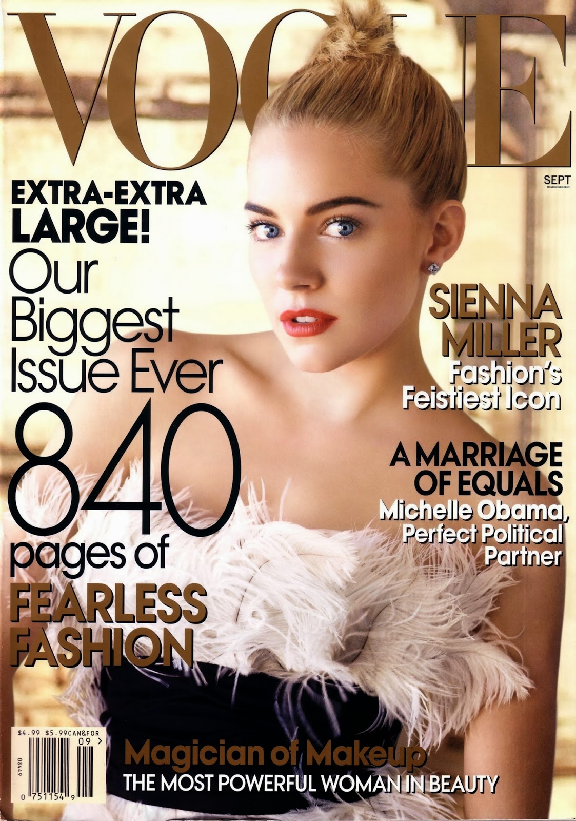
In the film (The September Issue) they photo-shopped the head of the model from one photo onto the body the same model on another. They would probably argue that it’s not too morally unacceptable because it’s still the same person but others would say it’s not a completely truthful representation of how the model was. What could be seen as more morally outrageous is the fact that they air brush photos and digitally manipulate them. In the film they combined two photos together, then airbrushed them so it looked like one photo. It alters the truth of the situation.
Below right: The front cover photo in question. Sienna Miller on the cover of Vogue, September 2007. (The body and head merge).
Take away the fancy costumes, make up, lighting and any other picture enhancing aspects, and even before any photoshop, the models are size zero. Now everyone knows that almost no-one in normal society is that small, which makes all the photo's misleading. It gives the public an unnatural, unrealistic view of a healthy body image. You could say that it almost hints that you must be really, really skinny to be successful and the viewer gets the idea that they should look that thin, almost unhealthy. You could also say that the models look like mannequins, but then that is probably the intention. Shops put mannequins in their windows to advertise their products, so the size zero body shaped models are just replicating such a familiar sight.
What about plus size models? The only time they would use curvier women, is if they were well known in society, e.g. celebrities. But ultimately the only reason they would do that is to widen the profile of the magazine. Vogue America is yet to take a leap with larger women but Vogue Italia is one of the first high profile magazines to publish a plus sized woman on it's cover. Vogue's contemporary Elle Magazine has already done this plenty of times.
 Left:
Left: Plus sized models Tara Lynn, Candice Huffine and Robyn Lawley
on the cover of Italian Vogue. The cover story within the magazine rejoices in amazing curves that larger women have and the sensuality that accompanies that.
Tara Lynn, Candice Huffine and Robyn Lawley
So to conclude, any photo within a fashion magazine is constructed. The models are specially selected for the shoots. The costumes, settings, lighting and make up is all arranged for a purpose.
In a broad sense, Anna Wintour manipulates the whole vibe of the issue because she chooses what to publish. She can arrange it however she likes and doesn’t hesitate with her decisions, it’s either yes or no unless it’s fur, then it’s always a yes.
619 words


